

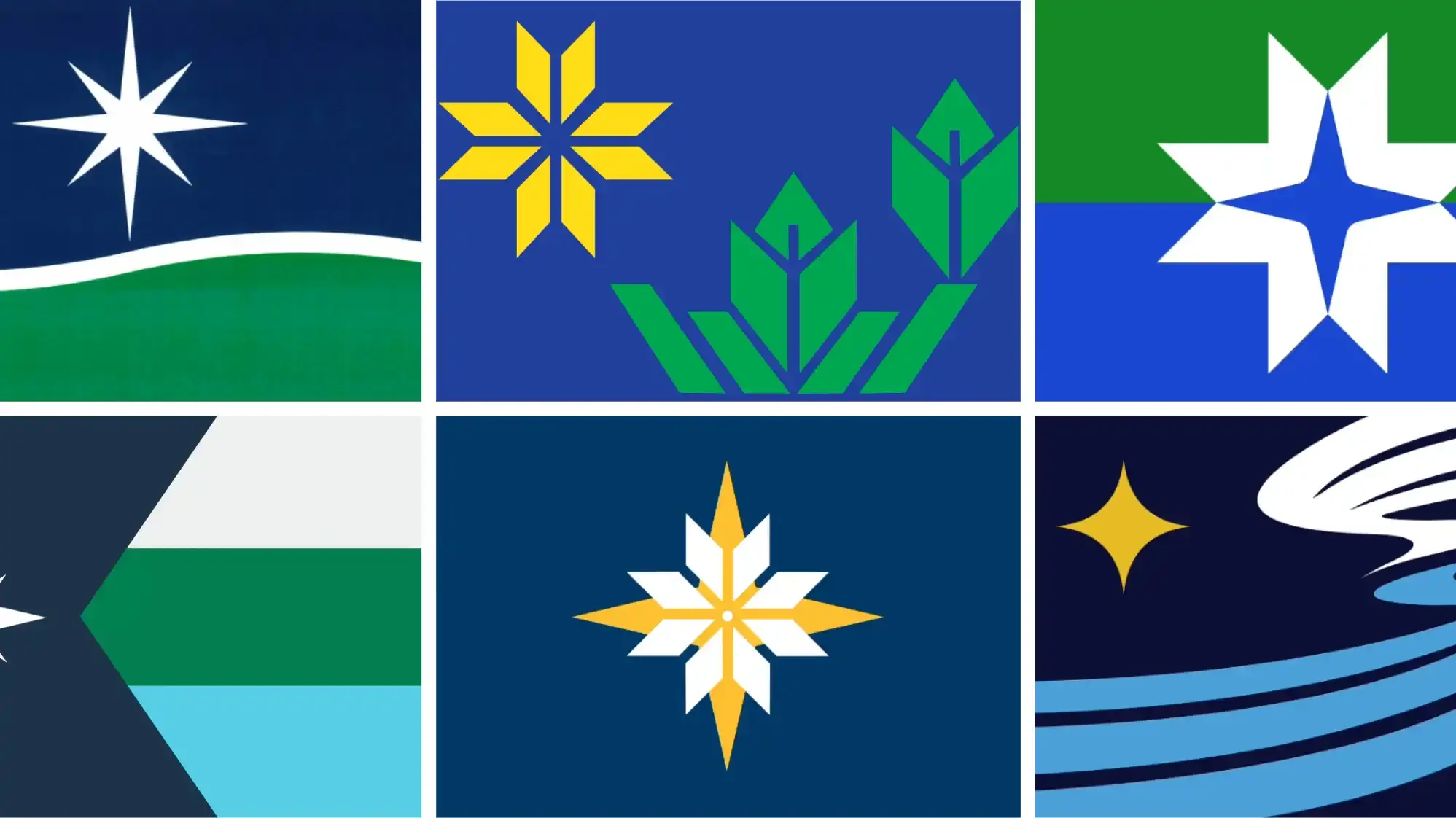
Minnesota’s most intensely debated art contest in memory is down to six designs for the next state flag and just a handful for the official seal, a tiny fraction of the more than 2,500 in total submissions.
For Brandon Hundt, that two of his submissions — one for the flag and another for the seal — remain in contention is an achievement in itself.
“This whole last 24 hours have just been surreal,” said Hundt, a Twin Cities based product designer and writer. Hundt spoke to MPR News on Wednesday after the State Emblems and Redesign Commission selected his concepts to move to final consideration.
The one with the origami flowers is awful. I still haven’t seen any explanation as to what these are supposed to symbolize.
’d probably choose the one that looks like a white snowflake on a yellow star against the dark blue background. It’s simple, straightforward, and modern.
Same vote here. There is also a matching state seal in the running which would be nice.
I like the idea of the yellow and white stripes representing the tribes and counties on the origami flowers one, and could easily see that being combined with the snowflake/star. But the main design is iffy, I agree.