
15·
5 months agoI will buy the explanation that the game is too old to continue to support when they stop adding new microtransactions every six months or so
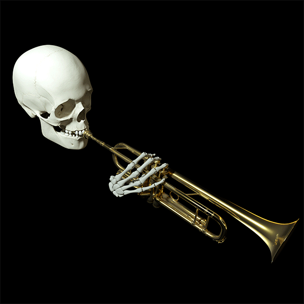
🎺🎺
I will buy the explanation that the game is too old to continue to support when they stop adding new microtransactions every six months or so

Convenience and familiarity, mostly. If you go to a McDonalds you know exactly what you’ll get and you’ll be able to get it pretty quick.

Has anyone ever said the first statement up there in the top-left? I wouldn’t doubt there’s some fringe group that would, but I also think they would be in the vast minority and you’d need to specifically go looking to find it. I dislike this kind of meme for that reason, it’s sowing a divide that doesn’t need to exist.
PSA: If it’s links on Discord, you can prefix the link with vx to make it natively embed so you don’t have to click through (e.g. vxtiktok.com). This also works with twitter links (vxtwitter.com). People out there hosting these domains doing the lord’s work
Appears to no longer be free, so I'm gonna take this down for now. If it was an error and it becomes free again, feel free to repost!

the smell of heavily chlorinated water. i used to spend a heck of a lot of time at the pool when i was a kid, and where i live now there aren't nearly as many pools, so it's not something encountered often anymore.
Any PR statement that includes the words "we hear you" can be safely ignored
Too late, I already own all the Stellaris DLC, my bad choices have been made long ago
Not sure yet! I’ve not bought a lot of games recently, but I do enjoy large swathes of the strategy genre. Stellaris, Civ 5 and 6, Terra Invicta, Frostpunk, etc.
Tried posting the video this time instead of a link to the news page.
Some welcome changes to the Lithoid species pack - tweaks to their unique origin, tweaks to Terravore to make it less fiddly. A new advanced space racism civic! (This is one of the weirder parts of talking about Stellaris.) Personally I’m a bit underwhelmed by the new portrait; It’s good art, but I really prefer more out there non-humanoid designs, which is the opposite of what they’re going for here. The quality of life changes to ascension perks and gestalt nodes are welcome as well. This kind of tidying up is why I like the whole concept of the custodian team.
Only real negative thing here is the increase on price for some older DLCs. It’s only two dollars, and they are tweaking them to be better, but I still feel like it’s gonna cause unnecessary backlash for little gain.

For the future, !outoftheloop@lemmy.world
I generally agree as well. This buff to bandages will also indirectly buff ammo boxes even more, and medics will still have their niche in being able to heal others without even using up their bandage supply.
Meaty update here. I’m not one to comment on weapon balance too much, but I do wonder: Do you think that all classes being able to self-heal a bit with the bandage will significantly shake up the game?
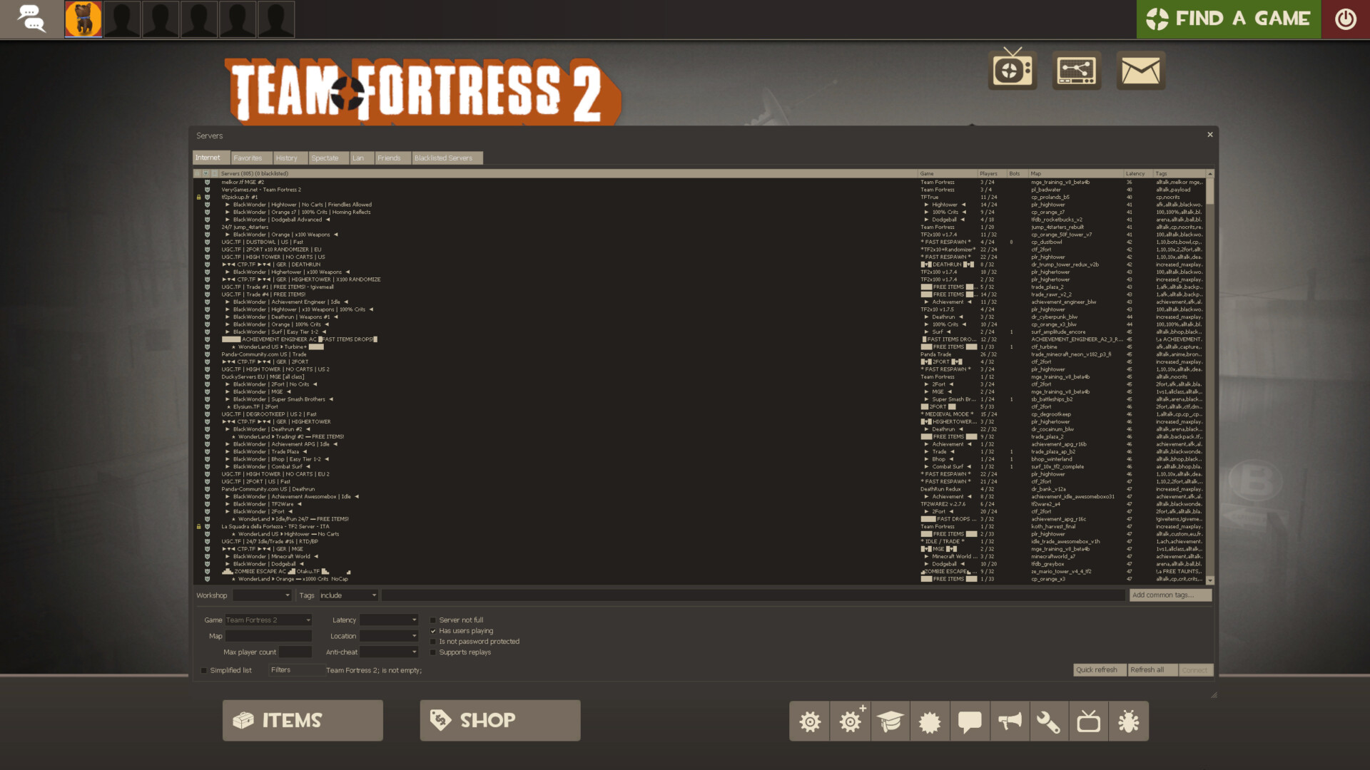
(Screenshots taken from the Interface in Game site, here: https://interfaceingame.com/games/team-fortress-2/)
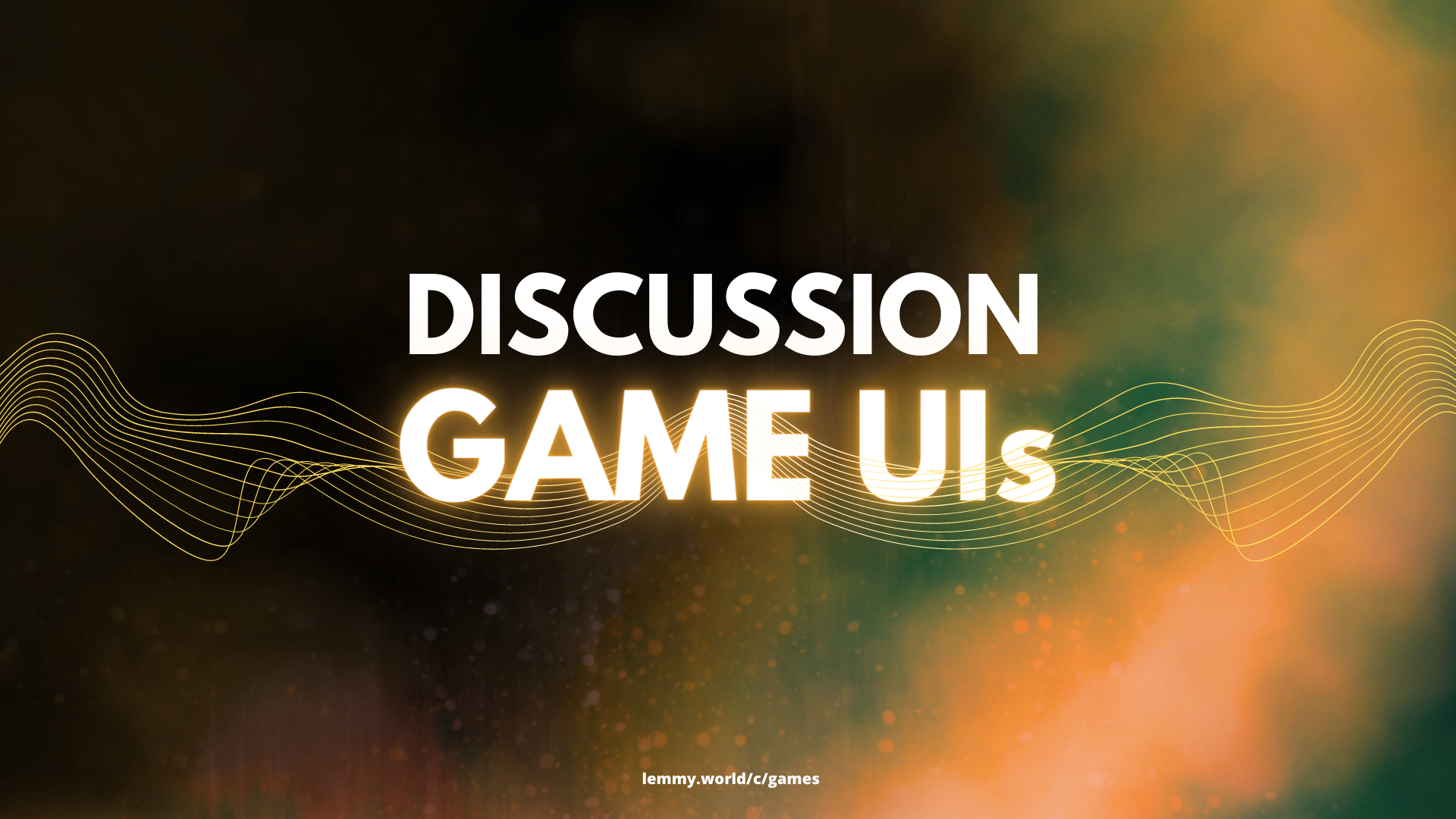
I wanna talk about the game I’m currently absorbed with, Team Fortress 2. TF2, being rather old, allows total customization of the UI, from the HUD to the menus. The default UI is clear, but also dated in places; you can really see where they slapped on new elements that clash a bit with existing ones, like the medals on the scoreboard compared to other elements, or the loading screen for a map, which has the very old Source infobox in the bottom right, a stylized background and panel taking up most of the screen, and a well integrated but still a bit off info bar at the top that was added more recently. The most glaring example is probably the community server browser compared to the newer slide-out tabs and menus for navigating play options. If Valve was still doing major work on this game, I’d say they need a good UI unification art pass.
When browsing TF2 custom HUDs on a site like this, there’s quite a few different styles to choose from, ranging from those that attempt to refine the vanilla HUD to those that make it something entirely different. Many competitive players prefer minimalistic HUDs that put pertinent information like health and ammo count closer to the center of the screen, so that one doesn’t need to divide their attention while fighting. Still others will pick a HUD that is a different style but still “complete” and fleshed out; even others still will fill their UI with memes (which I never understood, but to each their own).
Sometimes you just have to appreciate the little touches, though, like the animations and presentation on a map’s video tutorial and the class select screen. It oozes a particular aesthetic that the game has deviated from, over time.


we have to go back to our roots