What fonts are you currently using on your system? Which do you think is best for the terminal or for your desktop environment?
(updates) Ok I think I’m a fan of Ubuntu nerd fonts right now
Biolinum O for desktop
Liberation Mono for terminal
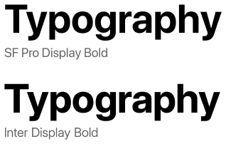
Inter everywhere
Personally, whatever is default.
I know that may sound weird, but I’m a huge fan of sane defaults that I don’t even notice are there.
SegoeUI, it’s damn good and well made
Inter for desktop and the nerd-font variant of JetBrainMono for Terminal.
+1 for Inter. Kind of reminds me of San Francisco :)
🟨 preview: Inter

Lol I re-discovered Inter about 10 minutes ago, I find it a little better than Noto Sans. (edit) I’m not really sure, maybe I’ve gotten too used to the Notos.
I’ve been enjoying Fira Sans and Fira Mono for far too long: https://mozilla.github.io/Fira/
Please don’t hate me but for desktop I use Segoe UI. After years of using it everything else looks just kinda off and cheap to me. Similar to when folder icons are not yellow
It is a well-designed system font. Say what you will about Microsoft but they do know how to make a good font or two.
Nothing wrong with that! I prefer Inter for nearly all UIs these days, but I still think Segoe UI looks better than GNOME’s current default of Cantarell.
I’ve been a fan of IBM Plex for a while now.
Iosevka.
Same. I’ve compiled a custom variant of Iosevka for terminal and code, because I want to have some chars in a certain way, especially the 0 and the & for even better readability. I used to have Monoid for code and terminal, but it the pixel perfect size for 12pt was getting too small for me and my eyes are not getting any better. Iosevka looks better even after some hinting by the OS.
On the rest of the desktop UI I use B612, because it is very ledgible, I recently switch over from the hyperledible Atkinson font. Before that I had Gidole on the desktop. Very pleasing, but not that readable at same font size.
Iosevka fits very well with East Asian characters, if you need those.
I find it narrower than I like otherwise, but I need Japanese characters often enough that I put up with it for my terminal.
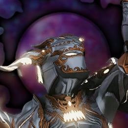
Protomolecule for that scifi feel
As a huge expanse fan, I’m glad someone brought this to life! (Shout-out for the space the nation podcast if you like nerds breaking down the episodes and need a good back catalog for the dark winter days)
Protomolecule everywhere? 0.o
Scifi fonts remind me of old Rainmeter configurations. Wonder if Rainmeter ricing is still around
🟨 preview: Protomolecule

Except the terminal and a few other places.
While it’s very good looking, it’s not extremely practical with no difference (almost) between lower case and upper case letters.
Ubuntu font. Idk why but I like it.
I agree! Nice memories of hitting backspace in a Linux Mint terminal and hearing that weird-ass BWOUP sound.
I recommend Ubuntu Mono for Termux users. Look at this black-background beauty – way better than the angly flat default

Since basically forever I use DejaVu Sans for UI elements and DejaVu Mono for the terminal.
me too, I loved Verdana before I discovered FOSS and DejaVu Sans is basically FOSS Verdana
I always use Dejavu sans mono for terminal and programming too. I think its the best in terms of readability where indentation is important
I’ve been using Source Code Pro for a while now. Might not be the best, but it does the job for me.
me too, i use it for terminal as well
Hack nerd font is my go to for terminal use.
For desktop, I’ve liked Lato, Source Sans Pro, and Inter to name three.
For terminal, I used Iosevka’s customizer to create a gorgeous Fira Mono-like variant that I call Iosevka Firesque:
[buildPlans.IosevkaFiresque]
family = "Iosevka Firesque"
spacing = "term"
serifs = "sans"
noCvSs = true
exportGlyphNames = false

  [buildPlans.IosevkaFiresque.variants]
  inherits = "ss05"

    [buildPlans.IosevkaFiresque.variants.design]
    capital-g = "toothless-corner-serifless-hooked"
    capital-q = "crossing-baseline"
    g = "single-storey-serifed"
    long-s = "bent-hook-tailed"
    cyrl-a = "single-storey-earless-corner-serifed"
    cyrl-ve = "standard-interrupted-serifless"
    cyrl-capital-ze = "unilateral-serifed"
    cyrl-ze = "unilateral-serifed"
    cyrl-capital-en = "top-left-bottom-right-serifed"
    cyrl-en = "top-left-bottom-right-serifed"
    cyrl-capital-er = "open-serifless"
    cyrl-er = "earless-corner-serifless"
    cyrl-capital-u = "cursive-flat-hook-serifless"
    cyrl-u = "curly-motion-serifed"
    cyrl-capital-e = "unilateral-bottom-serifed"
    cyrl-e = "unilateral-bottom-serifed"
    brace = "straight"
    ampersand = "upper-open"
    at = "threefold"
    cent = "open"


