I found this searching for information on how to program for the old Commodore Amiga’s HAM (Hold And Modify) video mode and you gotta touch and feel this one to sneer at it, cause I haven’t seen a website this aggressively shitty since Flash died. the content isn’t even worth quoting as it’s just LLM-generated bullshit meant to SEO this shit site into the top result for an existing term (which worked), but just clicking around and scrolling on this site will expose you to an incredible density of laggy, broken full screen animations that take way too long to complete and block reading content until they’re done, alongside a long list of other good design sense violations (find your favorites!)
bonus sneer
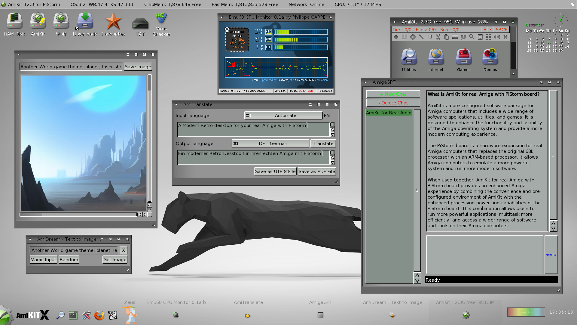
arguably I’m finally taking up Amiga programming as an escape from all this AI bullshit. well fuck me I guess cause here’s one of the vultures in the retrocomputing space selling an enshittified (and very ugly) version of AmigaOS with a ChatGPT app and an AI art generator, cause not even operating on a 30 year old computer will spare me this bullshit:

like fuck man, all I want to do is trick a video chipset from 1985 into making pretty colors. am I seriously gonna have to barge screaming into another German demoscene IRC channel?


Here's some meandering thinking on this…
I use an iOS app called Toot! and it does something special that helped me realise a distinction from sites like this.
The Toot app has all this weird stuff in there, none of which gets in the way, none of which serves any purpose, it's just weird. For example if you click on the action menu in a user profile it has an option "scan user" which plays a cheesy robot-view style scan animation over the page. Or if you unfollow someone, their avatar animates out of the bottom of the screen like a ghostly soul leaving the body.
Anyway, in UX design there is always talk about things like "micro animations" like elastic movement of scrollable items, subtle parallaxing, etc incorporated into the ui interactions. They talk about "conversational ui" where all of the text is conversational - "oh no, there are no results for your search!.." kinda bullshit. The idea being that you are brightening up a user's day, bringing delight, and all that shit. This all ignores the hard truth that craigslist still works fine. But that's beside the point.
The distinction, I think, between these two things is warmth and coldness. Toot! is a capable but otherwise standard masto client, it's actually a bit confusing to navigate in some places - but it's got that thing where you can tell it's a small team who have fun making it - the effect is a bit like contagious laughter. On the other hand you have the UX designed, orderly implementations of fun that don't give you any indication that the thing was made by people. That's where the coldness comes from and I don't think that even registers as a factor among the people who talk about "human-centeredness" in design. Not just that you're designing for people, because why the fuck do you need to be reminded of that, but that the person(s) making something should leave some imprint of their work in that thing.
This is similar in philosophy to the physical products that show signs of use over time. Instead of putting the imprint of the makers in the mass-produced thing, they let the thing collect the imprints of the owner/user so they see themselves in it. Like early macbook pros with thin aluminium shells rather than the modern solid unibody, they collected dents over time.
I don't buy into the trope of IKEA furniture having this effect because you "build it yourself" btw. That's marketing bullshit that ignores the fact that IKEA sells because it's cheap as fuck and you can furnish a room with one trip in your hatchback. Big item garbage pick-up days should be called IKEA garbage pick-up day.
so yeah. This site is an example of coldness via simulated warmth.
these are very good points
for some reason I can’t stop thinking about a web app I use daily that randomly plays a confetti animation when I interact normally with it, then pops a notification that reads “you just saw an animation! we’ll play these from time to time.” and it displays that notification every time there’s an animation with no way to turn either one off, and I can’t remember why but either the animation or the notification is implemented so poorly it actively interferes with my workflow for a few seconds
the phrase "corporate mandated fun" popped into my head as I watched this site, and I think it ties in with what you said here
re-reading this after coffee - need to avoid writing opinions so early in the morning