

That Firefox logo was simplified, but not oversimplified. Even with a very small icon size you can still tell it’s a fox that is (on?) fire. The Firefox Family logo is oversimplified, just being a swoosh, basically.
well the family logo is supposed to be as simple as possible
I beg to differ. Until now I never noticed the fox in the logo. And even now that I know it’s there I have a hard time finding it. And I’m looking at a version of almost 1cm on my screen.
Well, I suppose it makes sense that it doesn’t apply to everyone, but my guess is that the majority can still see the fox.
Either way, the simplification of modern logos is a necessity, because they are used in small UI elements, often even appearing monochrome. At which point they still need to be recognizable. Whether they are simplified in a good or bad way, is subjective though.
Never forget what they took from us

I still think the 2017 logo was their best, like a nice middle ground between this version and the current one:

I like this one. New ones missing the paw and has an odd tail end to me.
Agreed. This is the best one. And yes the new tail is awkward, I was thinking the same thing.
Those bastards cut off his arm!
This gives me the warm fuzzies
I liked this so much more! It was cute and charming.
The new logo looks so office neutral/corporate friendly.
I seem to be the only one who likes the new Firefox logo. It’s way more colorful!
The new logo looks sleek and nice, but I personally just really like more complex logos.
You might like them in isolation but icons need to exist in a lot of uis and contexts so having an overly detailed one will make it look weird when juxtaposed with what’s around it.
You are not alone, we just don’t meme about it.
I like it too, the old one was too detailed which makes it stand out too much. Icons need to work in a lot of contexts so simpler is almost always better.
The old one was great – in the context of late 00s to early 2010s design philosophy. It fit right in with Apple‘s skeumorphic design language and Microsofts Aero design. The new one is the perfect answer to the modern, more minimalist design. (Although I’m glad we’re mostly out of the "flat“ design era of Windows Metro and similar UIs)
That’s true, it fit in with the trends of the time. I guess part of my feeling is that I never actually liked skeumorphic design so I’ve been happy that flat caught on. There was a period where it did get too flat, but I like the middle ground we’re at now.
I miss Aero design so much.
I think most actually like it more, it’s just people are a lot more likely to come online and make posts if they dislike something.
∆
I think the same. The old logo also had a weird Nintendo 64-like 3D.
I’d be happiest with the simple one in the old colours.
Orange and blue look way better to me than light orange and purple.
personally I think it’s not bad, but I still haven’t gotten used yo it
tbh it smh feels like they just changed it a month ago, idk when they actually changed it
I used to not like the new Firefox logo when it first came out, but by now, I couldn’t do with the old one, it looks so much… And I bet if they changed it back, it would take me 2 months max to switch opinions right back.
At some point I have to accept, I’m just an ape of habit.
Honestly, its considered a hot-take but I do like minimalistic logos cause they are easier to recognize. Also they tend to better fit with the rest of the UI and products.
Counterpoint is the bullshit Google did with all their icons. Same exact colors with different shapes makes quick differentiation an actual challenge.
That’s gotta be an icon pack, given the black and the weird colors. Am I wrong? Did they change it since I last used the stock icons?
I forgot I had an icon pack on. Original is actually worse. No large silhouettes to work with.
Not disagreeing with you there. I wasn’t even much of an icon pack guy until they did the white circle thing. It looks so cheap
And then they introduced to android a new option that only showed the shape of the icon in two tones. Now they have no colour and are just odd shapes.
I can’t tell you how often I’ve opened Google Drive when I meant to open the Gmail app or vice versa.
I know they technically don’t look that much alike, but at a glance they’re way too similar. Just use a different color for each app please?Although the icons are kinda not minimal with the amount of colors in there, they could have like made one app with one or two colors and the other with different ones
Why does Drive not match the color tone of the rest of them? It’s so muted.
Those icons absolutely do not look normal, there’s some kind of theme being applied to all of them, likely a dark mode before it became a standardised feature, by the looks of it.
deleted by creator
It all depends on context. The Firefox logo is good and fine as a brand logo you can put on the product website, big enough, or the about dialog. But as an application icon I dislike it. I would prefer a simpler, more recognizable, flat-colored version.
I generally agree. However, for the MDN Web docs icon, I’m not sure I’ll ever acclimate to that one, even with how often I see it. so bad. Love MDN still though
The new reddit logo is pretty awful but both Firefox logos are fine IMO. They are both pretty well done, just in different styles.
Are they trying to fool investors that it’s a messaging service? The little tail on the bubble makes it look like a WhatsApp ripoff.
Yup, the design for Firefox’s logo is just a million times better than reddit’s, simplification arguments aside. FF just did a much better job.
Snoo looks like they have a beard now…
Which better represents the people on reddit. That’s good innit?
The new reddit one is so fucking weird to look at.
It makes the snoo a little too human, I get uncanny valley vibes from it.
The Firefox logo is great though. It’s not over simplification. It’s just keeping up with the times and doing a great job of it IMO.
idk, i like the new Firefox logo
Yeah the old one was cool too but I don’t really have anything against the new one either.
I like both the firefoxes. They’re good boys!
I also like the old alien. I’m not someone who generally gets upset when companies introduce a new logo, but the new alien is just nightmare fuel. Get away!!
If they didn’t change the firefox logo, it’d definitely look extremely dated today though
I like the new Firefox logo though. Except little foxy needs it’s paw back.
needs its* paw back
Apostrophy for possessive is OK. Iirc, it’s just uncommon on “it’s” solely to differentiate between “it is”. I know for a fact this is what I was taught in college and still have the English book. Some teachers and books written by those teachers pretend there never was a hard rule for possessive apostrophies.
For example, the AP styling guide says do not add an extra ‘s’ for singular possessive when the word already ends in s or z, but traditional English rules say do it.
Yeah, it gets complicated when formal rules can just be made up. I had a group of professors who published a little sheet saying, “These are the ways we like it, but unless it’s truly horrendous, you aren’t getting knocked for it.” Their rule was something along the lines of pre-Roman fall, names that ended in -s don’t get an extra ‘s, but afterwards they do. So Jesus’, but Aquinas’s… /shrug
Let’s talk about the real issue, how do I make proper boundaries that are singular and possessive plural? Imagine a restauranted Pop’s. Is it Pop’ses?
Well, it’s obviously Pop’ses’s.
Is Pop’ses is the plural, the plural possessive would be Pop’ses’
The Reddit one looks like if they made a mobile game that’s just another Candy Crush clone.
OP: „I don’t like change.“
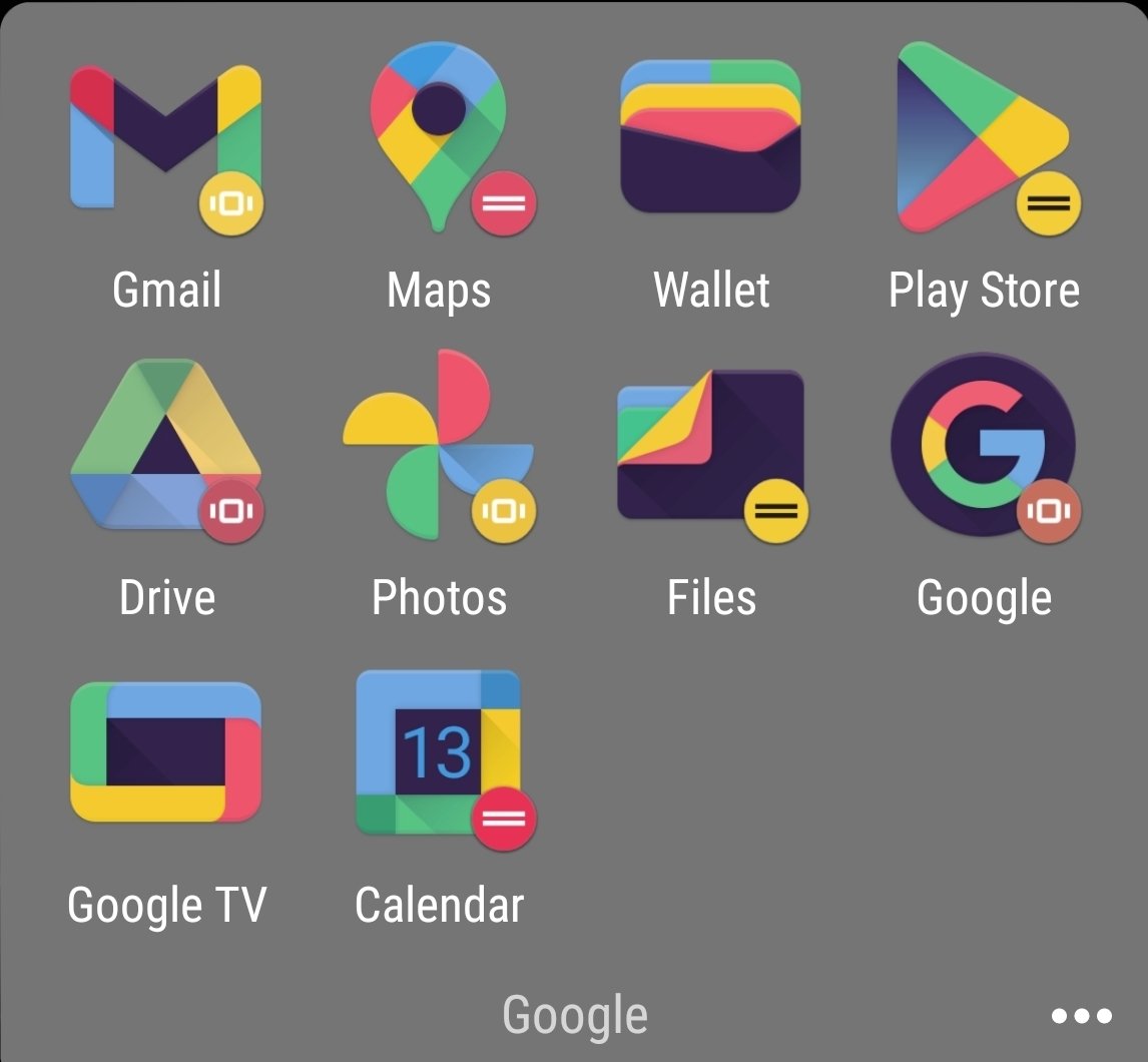
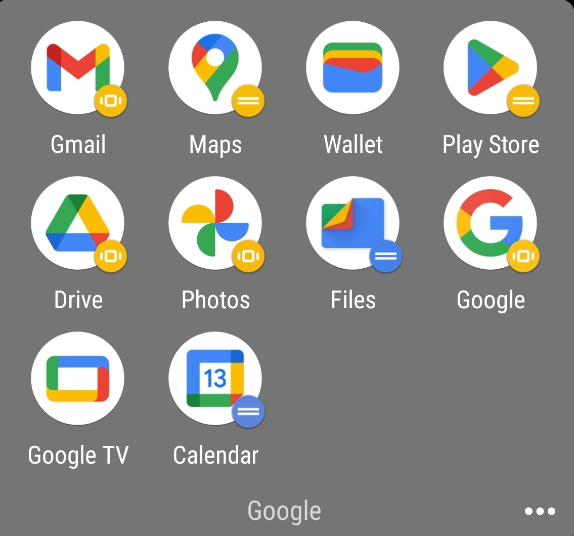
Let’s talk about this stupid “Let’s put a useless white background under our icons” trend.
Be honest, which looks better?


Oh hey it’s the maps logo, or is that the calendar logo? Nah it’s the files logo. I guess it could be the photos logo…
Really great when I’m trying to find something in a hurry.

The right answer.
Google forgor about PNGs 💀
Google also forgot about WebP. A format they created.
Jpeg xl baby!
The new reddit icon looks like when kids draw on teeth for giggles.
I liked the new Firefox logo when it came out, but I think now I would appreciate it if logos became a little more sophisticated again.


